Hue and I Can Get a Bit Colorful and Wild!
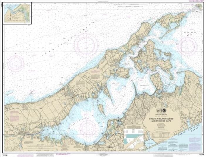
NOAA Chart 12358 as it appears in its default color scheme
In twelve years of talking with designers, it seems that most find the five colors of a NOAA nautical chart (beige, magenta, light blue, sage green, and black) subtle and decorative enough to go with just about any décor. To us, it is an interesting observation that such a subdued, pastel nautical chart can have such an powerful impact when enlarged to mural proportions. Such a wall mural demands attention, yet easily yields to other decorating elements in the room. A most fascinating yin and yang, to say the least.

But every now and then, a client requests a color change. Often, it is just one color that just doesn't sit right with the client, and then Kathryn takes over with some very advanced Photoshop skills to meet the client’s need. She has developed some specialized techniques to keep the color values intact when the chart is enlarged to mural size. In short, the process is complicated, and no, we are not sharing that particular secret in this blog!
Still, sometimes the desired color change can be as simple as tweaking the Hue and Saturation of a nautical chart. You can find these controls for yourself in Photoshop by choosing “Color” then “Adjustments.” Hover your mouse pointer over the various gray icons until you find “Create a new Hue/Saturation Adjustment layer.” A panel with sliders appears.

Hue set to - 30; Saturation to + 51
Default in the pull-down menu sets the sliders in the middle position, but playing around with this sliders creates some interesting, if not downright funky looks to a nautical chart. The nice thing is that you can see the colors of your chart being altered as you move the sliders.
There are several other color effects to play with in Photoshop. Black and white actually is a great color option. Sepia works when trying to achieve a antiquated look. I have had designers do an entire chart as a monochromatic color scheme to match painted walls that surround the nautical chart wallpaper mural. (See my January 19th blog, "Which comes first? Wallpaper or Paint?)

Things get a bit crazy and colorful with Hue at - 180 and Saturation at 100
The color options you find in Photoshop are amazing and worth an investment in time to learn some new techniques for you -- or your clients.
These two additional charts illustrate just how much change is possible with just the two slider controls of Hue and Saturation.
So while most seaside décor is subtle, even those with dramatic and unconventional taste may find good reason to have nautical chart murals in rooms where colors roam free and wild!